Icon Pack Studio
- 4.0
- Rating
- 10.00M
- Installs
- Free
- Price

 Analysis by App-foxy
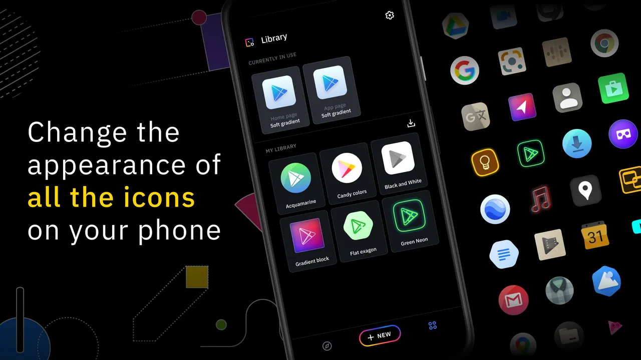
I spent time with Icon Pack Studio as a personalization app rather than treating it as just another collection of ready-made icons. Its main idea is to let me build and edit an icon pack so the home screen feels more consistent with my own taste. That makes it especially interesting for people who are tired of mixing unrelated icon styles, but it also means the app asks for more involvement than a one-tap wallpaper or launcher theme.
The app comes from Smart Launcher Team and is free to start using, with optional in-app purchases ranging from $0.99 to $11.99 per item. It is rated for Everyone, works on Android 7.0 and later, and the current version is 2.3 build 004. With over 5 million installs, it is clearly not an obscure experiment, although its average score of 4.2 from around 18 thousand ratings suggests that the experience is useful without being perfect for every phone or every user.
How Icon Pack Studio feels to use in everyday situations
When I use Icon Pack Studio during ordinary routines, I notice that its value depends less on making every icon match and more on choosing a visual pattern I can recognize quickly. I would begin by testing that pattern on the apps I open most, then consider how the same choices hold up when the wallpaper or lighting changes. That practical test leads naturally to the tradeoffs involved in building a style of your own.
You May Also Like

 Blood Strike: 2.5 Anniversary
Blood Strike’s Loadouts Turn Every Drop Into a Tactical Gamble
A close look at Blood Strike’s custom loadouts: how fast access to signature weapons reshapes its battle royale rhythm, rewards preparation, and narrows the gap between fights.

 Pandora - Music & Podcasts
Pandora’s Music Is Easy to Start, but Harder to Recover
Pandora’s strength is its low-effort path from a seed to a station. Its weak spot is how much confidence it asks you to place in connection, setup, and quiet recovery.

 8 Ball Pool
 Is Built on Rivalries, Rematches, and Routine
A close look at the rivalries, rematches, shared routines, and unanswered safety questions that turn a quick pool match into a persistent mobile community.

 Samsung Music
’s Quiet Strength Is Playing What You Already Own
Its reach comes less from spectacle than from dependable access to a personal library. That simplicity is both the app’s strongest retention engine and its ceiling.

 AccuWeather: Weather Radar
AccuWeather Review: A Quick, Clear Forecast for Everyday Decisions
For everyday plans, the best forecast is the one you can understand quickly. AccuWeather makes rain timing, radar, and local conditions easy to act on, with a few trade-offs.

 Hill Climb Racing
Why Hill Climb Racing Still Turns Crashes Into One More Run
A tiny car, a bumpy hill and one more upgrade: Hill Climb Racing keeps resurfacing because its simple chaos makes every near-miss feel personal.
More From Our News Desk



Readability starts with control, not decoration
What I like most is that the app treats icons as a visual system. Instead of downloading several packs and accepting whatever shape, color, or contrast the designer chose, I can work toward a look that suits my own screen. That matters when I want a calmer home screen, a monochrome arrangement, or icons that stand out more clearly against a busy wallpaper.
The first important distinction is that this is an icon pack maker and editor, not simply an icon gallery. A person who wants instant results may find the editing approach slower than installing a finished pack. I found the extra control worthwhile when I wanted several icons to share the same visual treatment, but it is less convenient if the only goal is to change one or two shortcuts quickly.
For readability, consistency can be more useful than visual novelty. When icons have comparable shapes and colors, I can scan the home screen with less distraction. That does not automatically make every icon easier to identify, though. A heavily simplified or monochrome design may look tidy while removing the color cues I normally use to find a banking, messaging, or travel app. My practical advice is to create a style gradually and check it during normal use rather than judging it only from the editor preview.
I also recommend keeping the first project deliberately simple. Start with a restrained background and a clear foreground, then test the result on both a light and dark wallpaper. An icon that looks crisp in the editor can lose definition when placed over a photograph or a colorful gradient. This is one of the app’s less obvious trade-offs: more customization gives me more responsibility for legibility.
Navigation is approachable, but editing takes attention
Icon Pack Studio makes sense once I understand the difference between choosing a visual recipe and applying it across a pack. The workflow feels more like adjusting a design template than browsing a static catalog. That is a strength for creative users because one decision can bring many icons closer together, but it can feel like unnecessary work for someone who does not enjoy tweaking details.
I found it helpful to make one change at a time. Changing the shape, color treatment, and background together makes it difficult to understand which adjustment improved or harmed recognition. A slower sequence also makes it easier to return to a familiar look if the new version becomes too abstract. This matters for people who rely on visual memory and prefer stable navigation from day to day.
The app fits best beside a compatible launcher that can apply icon packs. In practice, that means the editing experience and the launcher experience are connected but not identical. If a user expects the app alone to redesign every part of the phone interface, disappointment is likely. The home screen, app drawer, and system areas may still follow the behavior of the launcher and Android version being used.
That separation is worth understanding before spending time on a detailed pack. I would first check whether the launcher already in use can apply custom icon packs, then create a small test style. This avoids building a complete design only to discover that the preferred home-screen setup does not handle it in the expected way.
Supporting different visual preferences
Icon Pack Studio can support different visual needs because it gives me control over contrast, color relationships, and the amount of detail in an icon style. Someone with light sensitivity may prefer a subdued palette instead of bright, competing colors. Someone who loses icons in a crowded layout may benefit from a consistent silhouette and a stronger foreground-background separation.
Still, customization is not the same as dedicated accessibility design. The app does not turn small icons into large controls, and changing an icon pack does not replace Android’s own display, magnification, text, or contrast settings. I would treat it as one layer of visual organization rather than a complete solution for low vision or color-vision differences.
A useful workflow is to keep important apps visually distinct even inside a unified pack. For example, I might use a consistent shape for everything while retaining a different accent for communication tools or urgent daily tasks. Absolute uniformity is attractive in screenshots, but a little differentiation can reduce search time when I am in a hurry.
Another practical tip is to judge the pack at the phone’s normal viewing distance. On a large display, subtle lines may appear clear while holding the phone close, yet disappear when I glance at it on a desk. If an icon depends on tiny internal details, it may be beautiful but inefficient. I prefer designs whose main identity survives a quick glance.
Motor considerations: fewer decorative decisions can mean less effort
Icon Pack Studio is mainly a visual editing tool, so its motor benefits are indirect. Once a pack is prepared, a consistent home screen can reduce the need to search through visually unrelated icons. That can be helpful for someone who finds repeated scanning tiring or who wants a predictable arrangement for frequently used apps.
The editing phase is different. Creating a polished pack may involve repeated selections, previews, and adjustments. Users with limited dexterity, tremor, or fatigue may find that process more demanding than installing a finished pack. I would recommend working in short sessions and saving a usable version before experimenting further, rather than trying to perfect everything in one sitting.
There is also a useful distinction between setup effort and daily effort. The app may require more concentration at the beginning, but the resulting home screen can feel simpler afterward. Whether that is a good exchange depends on how often the user changes themes and how much value they place on a carefully organized interface.
For a person who changes phones frequently, the calculation is less favorable. Recreating a personal design can be enjoyable, but it is still another setup task after transferring applications and accounts. Someone who wants a stable, low-maintenance appearance may prefer a ready-made icon pack supported directly by their launcher.
Sensory context changes the best design choice
Visual customization behaves differently in different environments. Outdoors, reflections can weaken subtle colors and thin details. At night, a bright or highly varied home screen can feel more intrusive than a restrained design. In a moving car, on public transport, or while multitasking, I need icons that can be recognized quickly rather than icons that reward close inspection.
That makes Icon Pack Studio useful for creating separate approaches for different preferences, but I would not assume that one style works equally well everywhere. A design that looks excellent in a quiet room may be less practical in sunlight. I found that bold shapes and clear separation are safer choices when the phone is used in changing light.
Color is another area where personal taste and practical recognition can conflict. A single-color pack can make a screen look organized, but it removes one of the quickest ways many people identify applications. If I were setting this up for someone who depends on color memory, I would avoid flattening every icon into the same tone and would preserve a few meaningful visual differences.
Situational access: when the app is genuinely useful
A realistic everyday example is a phone used by someone who keeps work, family, finance, and travel tools together. A mixed collection of downloaded icons can make the screen feel noisy, especially when several apps use similar colors. With Icon Pack Studio, I can create a shared visual language, then keep the most important shortcuts in a predictable position. The result is not just decorative; it can make the first screen easier to understand during a rushed morning.
It can also help after changing a wallpaper or launcher layout. Instead of searching for a new pack that happens to match, I can adjust the existing style to fit the new background. That flexibility is a real advantage over fixed icon collections. The compromise is that I have to make the design decisions myself, and the quality of the outcome depends on how carefully I test it.
For families sharing advice about phones, the app may be useful when one person wants a calmer or more recognizable home screen. However, I would not assume that a style that works for me will work for another user. Some people identify apps by their original brand colors; others prefer shape and contrast. The best result comes from asking what the person uses as a recognition cue before changing everything.
It is less suitable for someone who rarely looks at the home screen because they open apps through search, voice commands, notifications, or a minimal launcher. In that situation, a detailed icon editor may offer little daily value. It is also not the right choice for anyone expecting it to redesign system menus, notification controls, or every icon inside every application. Its role is focused on the icon-pack layer.
Compatibility and maintenance deserve attention
The app runs on Android 7.0 and later, which gives it a broad range of supported Android versions, but the phone’s launcher remains an important part of the experience. Applying a pack is not only about the editor; the launcher must recognize and use the result. This is the first compatibility question I would resolve before investing time in customization.
Individual application icons can also be a source of friction. A pack can look coherent overall while a few less common apps remain visually different or require extra attention. That is normal for a system built around app-specific icons, and it means users who demand perfect coverage may spend more time maintaining the home screen than expected.
Updates can create another small inconvenience. When applications change their icons or when the launcher behaves differently after an update, the visual balance of a pack may need checking again. I would keep the design simple enough that adjusting it later is manageable. A complicated style may look impressive initially but become tedious when one element needs correction.
The free entry point makes experimentation easy, but optional purchases are part of the overall decision. Since individual items can cost from $0.99 to $11.99, I would try the basic workflow first and only pay after confirming that the editing tools fit my habits. The important question is not whether customization is possible; it is whether I will actually use the extra control often enough to justify spending on it.
Remaining barriers for inclusive use
The biggest barrier is the gap between creative freedom and immediate clarity. A user who needs a fast, predictable interface may not want to design an icon system. The app rewards patience, visual comparison, and willingness to test. Those are reasonable requirements for a personalization tool, but they can exclude people who find detailed visual decisions tiring or confusing.
Another barrier is that a highly customized pack can reduce recognition if every icon becomes too similar. This is particularly important for users with memory difficulties or anyone who relies on familiar brand imagery. I would preserve distinctive cues for essential apps and avoid treating visual uniformity as the only measure of success.
There is also the question of context. A home screen can be easy to read while the phone is held close, but less clear from a distance, in glare, or during a quick one-handed interaction. Testing under those conditions is more valuable than choosing a style from a static preview. If the design fails outside the room where it was created, it needs adjustment.
People who need strong nonvisual access should look beyond this app and use the operating system’s accessibility tools, launcher options, and assistive features as appropriate. Icon Pack Studio can complement those choices, but it should not be presented as a substitute. That distinction is important because a prettier icon is not automatically a more accessible control.
My inclusive verdict
I see Icon Pack Studio as a strong choice for Android users who want to shape their own icon language and are willing to spend time testing it. The Smart Launcher Team has made a personalization app that is more flexible than a fixed icon download, and its free starting point makes it easy to discover whether the workflow suits you. Its 4.2 average and large installed audience reflect that useful middle ground: capable and popular, but not frictionless.
The best result comes from treating readability as the goal and style as the tool. I would begin with contrast and recognition, keep important apps distinguishable, and test the pack in sunlight, at night, and during quick one-handed use. That approach produces a home screen that feels personal without sacrificing the cues that help me find things.
I would recommend it to users who enjoy customization, want a consistent appearance across their launcher, or need to reduce visual clutter in a personal way. I would skip it if I wanted a finished theme with no decisions, if my launcher does not work well with custom packs, or if I need dedicated accessibility controls rather than icon styling. For the right person, it is a thoughtful way to make Android feel more familiar; for everyone else, a simpler ready-made pack may be the more inclusive and practical option.
FAQs for Icon Pack Studio
01What is Icon Pack Studio and how does it work?
Icon Pack Studio is a powerful app designed for Android users to create and customize their own icon packs. It allows users to design icons for any app on their device, providing various tools and effects to personalize their appearance. The app integrates seamlessly with most custom launchers, making it easy to apply your creations.
02Is Icon Pack Studio compatible with all Android devices?
Icon Pack Studio is compatible with most Android devices running Android 5.0 (Lollipop) and above. However, its full functionality is best experienced on devices with custom launchers such as Nova, Apex, or Smart Launcher. It's important to check compatibility with your specific launcher before downloading.
03Do I need any design skills to use Icon Pack Studio?
No prior design skills are required to use Icon Pack Studio. The app offers an intuitive interface with easy-to-use tools, allowing even beginners to create professional-looking icons. Step-by-step guides and tutorials are available within the app to help users get started and make the most of its features.
04Are there any costs associated with using Icon Pack Studio?
Icon Pack Studio is free to download and use, but it offers in-app purchases. These purchases include additional features and effects that enhance the customization experience. While the free version is quite comprehensive, users may choose to buy extra options for a more advanced design toolkit.
05How can I apply my customized icons to my device?
Once you've created your custom icons in Icon Pack Studio, you can apply them through a compatible launcher. The app provides a straightforward process to export and apply your icon pack. Ensure your launcher supports custom icons, and follow the app’s instructions to seamlessly update your device's appearance.
Pros
- Highly customizable icon designs.
- User-friendly interface and navigation.
- Regular updates with new features.
- Compatible with most launchers.
- No ads in the free version.
Cons
- May drain battery on older devices.
- Limited options without premium purchase.
- Occasional bugs in the editor.
- Some icons lack detail.
- Not all launchers fully supported.

Icon Pack Studio
Gallery